How to Communicate Brand Essence and Personality with Color
We get so used to hearing marketing terms like branding that it’s easy to lose sight of the fact that what we’re really doing is making a connection with people in a way that’s not so different to the way we meet people in real life. What is a brand if not an “essence and personality” so well developed, that people sense something about the company or product right away, on first contact -- at first sight. It’s a gut feeling about who that brand is.
Of course some things are different, instead of faces and handshakes, brands have logos and taglines and many other facets, but together they form a collective essence capable of making a personal connection, and generating a sense of loyalty in people for one brand over another.
The psychology behind that connection is vast and complex, but today, we want to focus on how the color of your brand communicates your essence, specifically in how your brand colors relate to chakras, an ancient philosophy that explores, among other things, how different colors relate to different centers of spiritual essence.
So, what are chakras exactly?
Chakras are a concept found across several mystic and religious traditions in India of energy centers on your non-material body represented with different colors, each one connecting to a different aspect of spirituality.
Chakras are a great access point for branding strategy because these teachings are the product of generations of people meditating on the associations of color as it relates to spiritual essence, and it is undeniable that there is a universal quality to how we all relate to color.
Think about it. It’s why a sudden switch to blue and pink stage lighting can suddenly subdue an audience and pluck at a crowd’s heart strings, or why a fiery red sunset can fill us with a sense of glory. Our relation to color is more than surface, and Chakras are the accumulation of generations deeply exploring just what’s below that surface. If you want to use color to connect with people on a deeper level, the lessons of chakras are invaluable.
Why focus on color?
The color of your brand and logo is perhaps the primary distinguishing factor to consumers when they’re making a choice of which brand to buy. Studies show that human beings process visuals up to 60,000 times faster than written text, and nearly 85 percent of consumers cite color as the primary reason they choose a particular product
The connection people have with color happens before people have read a single word or learned a thing about you. It occurs within fractions of a second, and though people often dismiss aesthetics as superficial, it’s actually a purely emotional reaction that is telling us a lot about who that brand is. Again, it’s like getting a first impression from a person. You don’t know them, but you feel something about them instinctually that is probably more accurate than the things they are telling you about themselves.
Essence, Personality, and False Personality
These intangible but true feelings are directly addressed by the same teachings mentioned earlier. They are consequences of how we relate to essence - the truest and purest self underneath.
These ancient spiritual philosophies teach that every one of us is born with an essence, our essential self, innate capacities, talents, natural preferences, aversions, and tendencies. But pure essence alone cannot survive in the world, so it gets hardened, buried deep in the unconscious and a personality grows around it as a survival mechanism.
Personality & False Personality
Personality is like outer clothing surrounding essence, formed by an accumulation of habits acquired through exposure and reactions to experiences. Nothing in personality is hardwired; It is in a sense our programming. It is what we were taught to think and feel, our learned roles in life.
If we are lucky and enough to be guided by good parents and circumstances, our personality develops in healthy harmony with our base essence and the essence of others.
If we are less fortunate, we develop personalities and habits that work against that harmony, as we absorb the wrong kind of guidance and feel the need to become things we’ve been misled to think we should be.
Our personality in the latter case, therefore, rather than become an attempted harmonious expression of an inner essence, becomes many layers of masks suppressing that essence, to create an imaginary picture of ourselves and seek its validation in society.
What does this have to teach us about branding communication?
When our essence is beaten down and buried beneath a false identity, this creates a multitude of pain points. Inner desires are being starved, as the individual chases hedonistic or material experiences to feed their imagined image of themselves.
This is the worst manifestation of the modern commercial world, where consumption is driven by the consumer’s pursuit to construct a false personality with misguided experiences. Many advertisers focus on nurturing this pattern by aligning their products with these toxic pursuits that misdiagnose that pain and prescribe solutions which validate the false imagined self -- the masks.
This works, but marketing can also be used to resolve those pain points rather than exploit them, by properly appealing to the suppressed essence underneath. Chakras are a window into what those precise points may be.
In other words, marketing can align itself with the underlying desire for spiritual connection and harmony, and help bring into focus a real and positive need, rather than uphold and validate a false and toxic need. Chakras provide a roadmap for how to identify and connect to those points of spirituality using color.
So which colors connect us to which parts of our essence?
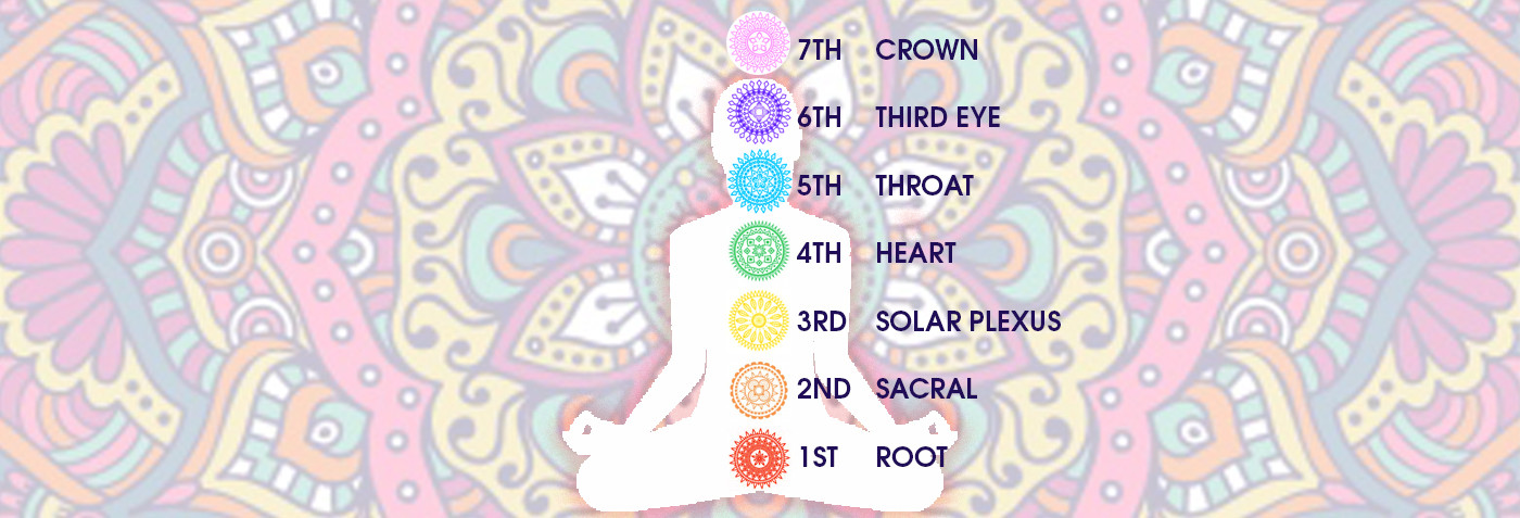
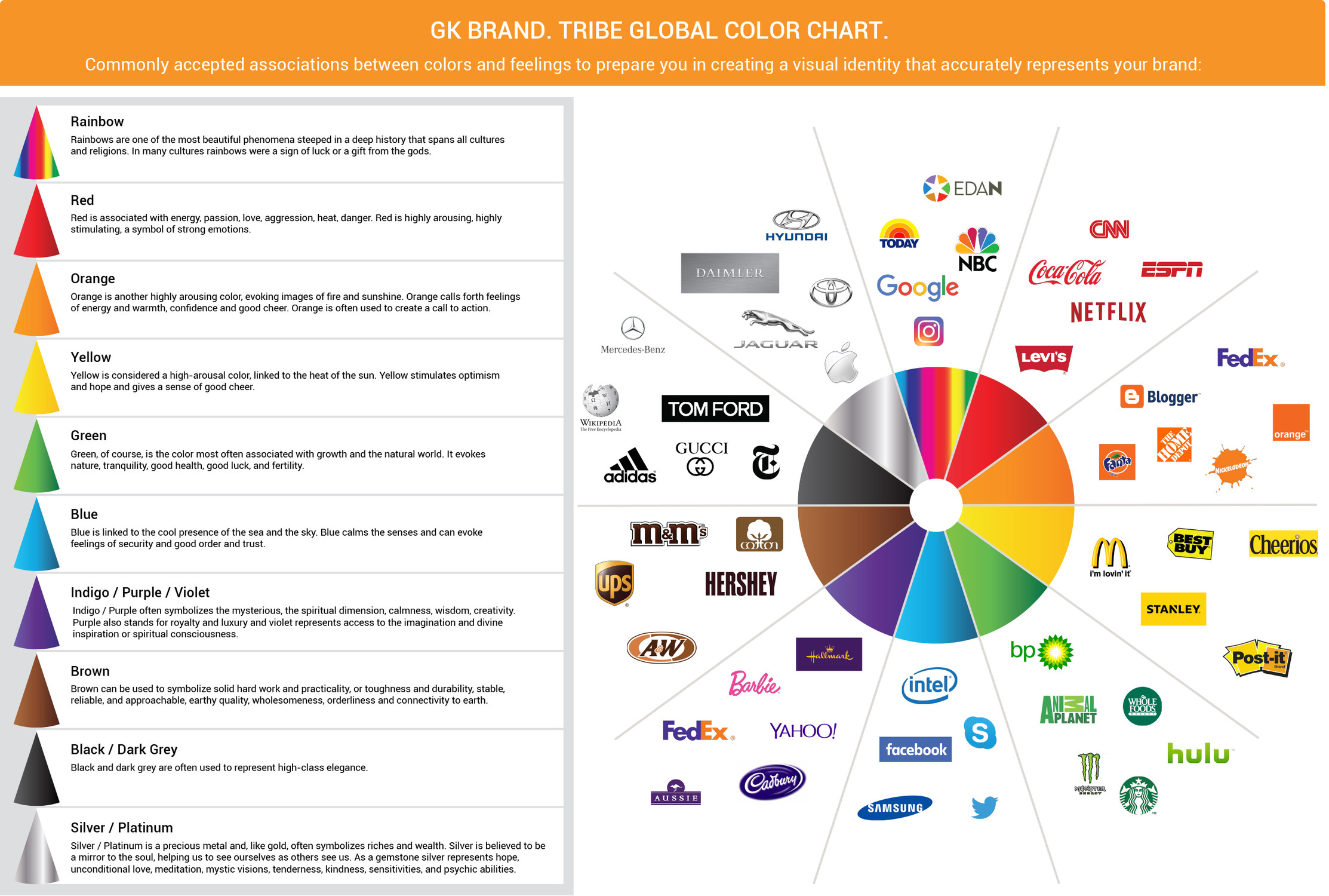
1st Chakra Red
Red is the first Chakra called the root chakra at the base of the spine. It’s the color of blood, and symbolizes safety, survival, the color of group identity, tribal power, family beliefs, connection to the earth, grounding, and nourishment from the Earth energy and one can say the infant stage of our development, many tribal cultures have deep connection to nature and the earth.
Potential branding implications:
Red is not just for standing out, the root chakra is great for communicating dependability but also urgency. Perhaps that’s why we see it in a news organization like CNN, or a pharmacy like CVS.
2nd Chakra Orange
Orange is the color of the second chakra, which is in the navel to top of the pubic bone. The partnership chakra, sexuality, creativity, relationships.
The sacral chakra is associated with the realm of emotions. It’s the center of our feelings and sensations. It’s particularly active in our sexuality and the expression of our sensual and sexual desires.
Motivated by pleasure, it’s the driving force for the enjoyment of life through the senses, whether it’s auditory, through taste, touch, or sight. Opening your sacral chakra allows you to “feel” the world around and in us. As such, it’s an important chakra at the foundation of our feeling of well-being. As a tribe, we have now evolved and create art and crafts and family and tribal relationships matter.
Potential branding implications:
While many will obviously latch onto the sexual component (maybe Hooters knew something when they chose orange), focus on the flowing emotional aspect. Flow represents both creativity and confidence, and it speaks to our need to boldly follow impulses. Think of Amazon shoppers who want to shop quickly, but also with purpose.
3rd Chakra Yellow
Yellow is the color of the solar plexus chakra, and it symbolizes power, self-esteem, and personal will.
Potential branding implications:
Yellow’s relation to power, ego, honoring oneself, like a sun that draws in everything that surrounds it. It gets our attention, and it communicates youthfulness and vibrancy. It keeps even old brands like McDonald's feeling young and alive.
4th Chakra Green
Green is associated with the heart chakra, center of the chest, emotional power. It is connected with love as divine power, joy, harmony, relating, integration, and compassion.
Potential branding implications:
Green is incredibly wholesome and makes people feel balanced. It’s the most restful color on the human eye as well. It’s easy to see why it pairs well with a company like Whole Foods, and why a company like BP would want to use it to find harmony with the environment.
5th Chakra Blue
Blue is associated with the throat chakra or will – avenue of expression, and it symbolizes self-expression, communication, expression of truth and love, asking for needs, creative expression, perfect form and patterns. Surrendering personal will to divine will.
Potential branding implications:
Blue is great for making people feel free to connect through their own self-expression. It makes you wonder about its prevalence in social media brands like Facebook, LinkedIn and Twitter.
6th Chakra Indigo
Indigo (between purple and deep blue) is associated with the third eye chakra of wisdom and becoming conscious. This energy evokes our intuition, extrasensory perception, and inner wisdom, seeking only the truth.
Potential branding implications:
Deep purple is great for when we want to feel an intuitive connection to something divine. Think Wonka (what is candy if not divine?), or the SyFy channel (science fiction is much more mystical than practical science, and benefits from allusions to forces unseen but deeply felt.)
7th Chakra Violet & White
The crown chakra top of the head is described as both purple and white. It is associated with the universal, it is our connection to spiritual self and represents consciousness. Live in the present moment
Potential branding implications:
So is it violet or white? Well, think of the brighter hues of purple, up into pink. It’s perfect for brands like Yahoo and T-Mobile, that want to make us feel connected to the universal, whether it’s a phone network or the web itself. Together, purple and white are popular in spa brands and wellness centers that aim to restore visitors not just physically but spiritually.
Final Thoughts
Choosing your brand color is choosing your first and most purely emotional connection to your consumers. Chakra’s are just another window into understanding our relationship with color, but it’s also worth noting that if it’s just a window, in this case, we’re talking about a very old window that’s the result of centuries of observation, looking in, meditation, thoughts and feelings, applied to our bodies and how we process this color input and how it influences us.
There’s whole theories rooted in color that have passed the test of trial and error through generations, at the very least, it’s worth a look. If you’re creating a brand, start with your relationship to different colors and search your feelings, then see if the chakras can help you decipher those feelings and put a fine point on how you use color to align your brand with an overarching brand strategy, values, archetype and philosophy.
If you learn one thing today, however, it should be that color is not just a fun way to customize your brand. You’re creating an association that is going to follow your company for quite some time. Color is the first and most immediate part of a message being sent about who you are. Choose wisely.
If you enjoyed this article, please Like and Share!
About the Author: Vasken Kalayjian is an accomplished Brand Strategist. Business Growth Specialist. Creating powerful brands that make an impact worldwide. GK Brand Tribe Global. Let's talk
#BrandEssence #BrandIdentity #Color #Branding #Naming #CompanyNaming #CompanyBranding #ChakraColors #BrandPersonality #ThinkColors